Some Context
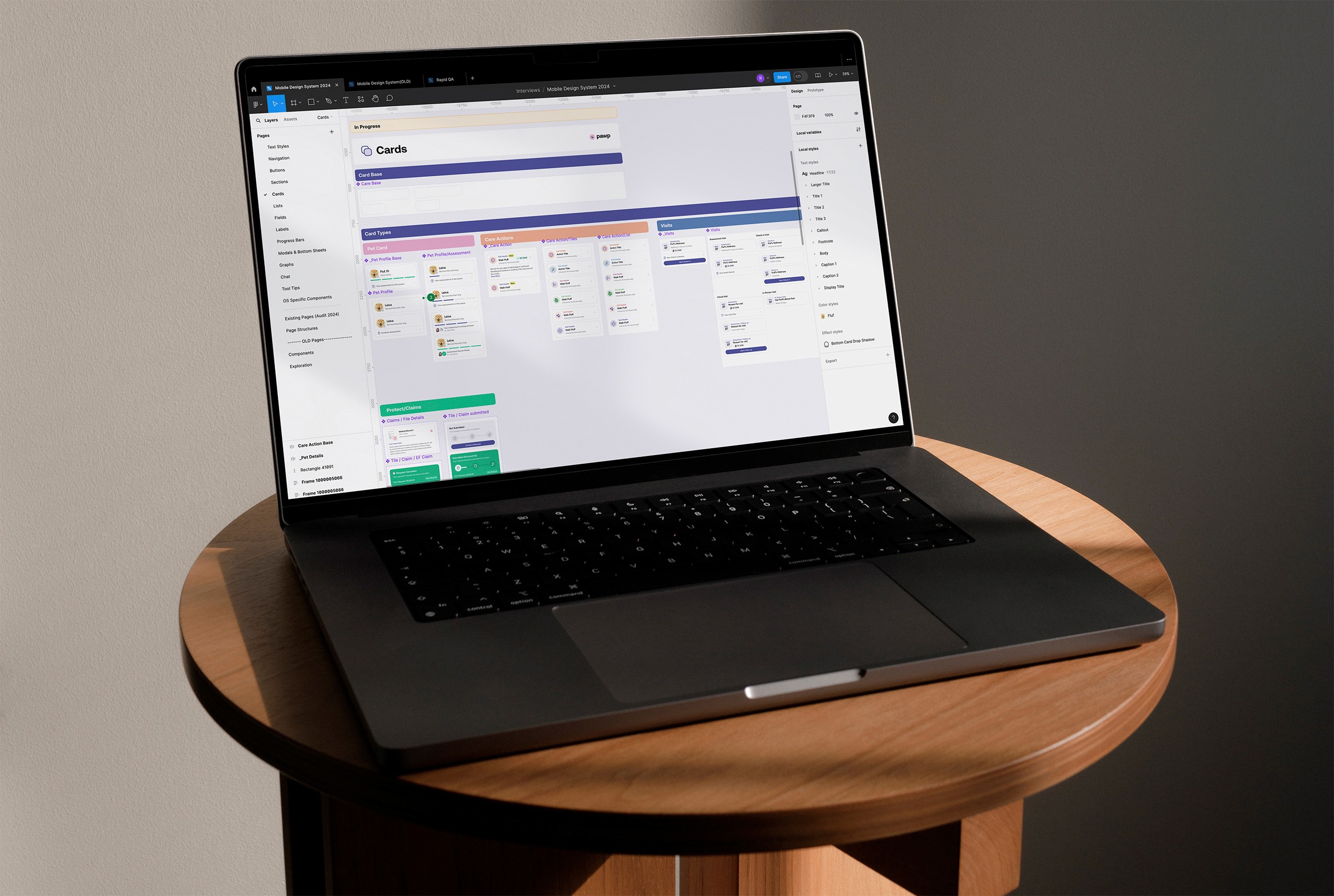
With the speed that Pawp was moving at, there were a lot of components that were created by past designers and developers. On top of that these components were often developed inconsistently between iOS and Android leaving them to look at different.
With the speed that Pawp was moving at, there were a lot of components that were created by past designers and developers. On top of that these components were often developed inconsistently between iOS and Android leaving them to look at different.
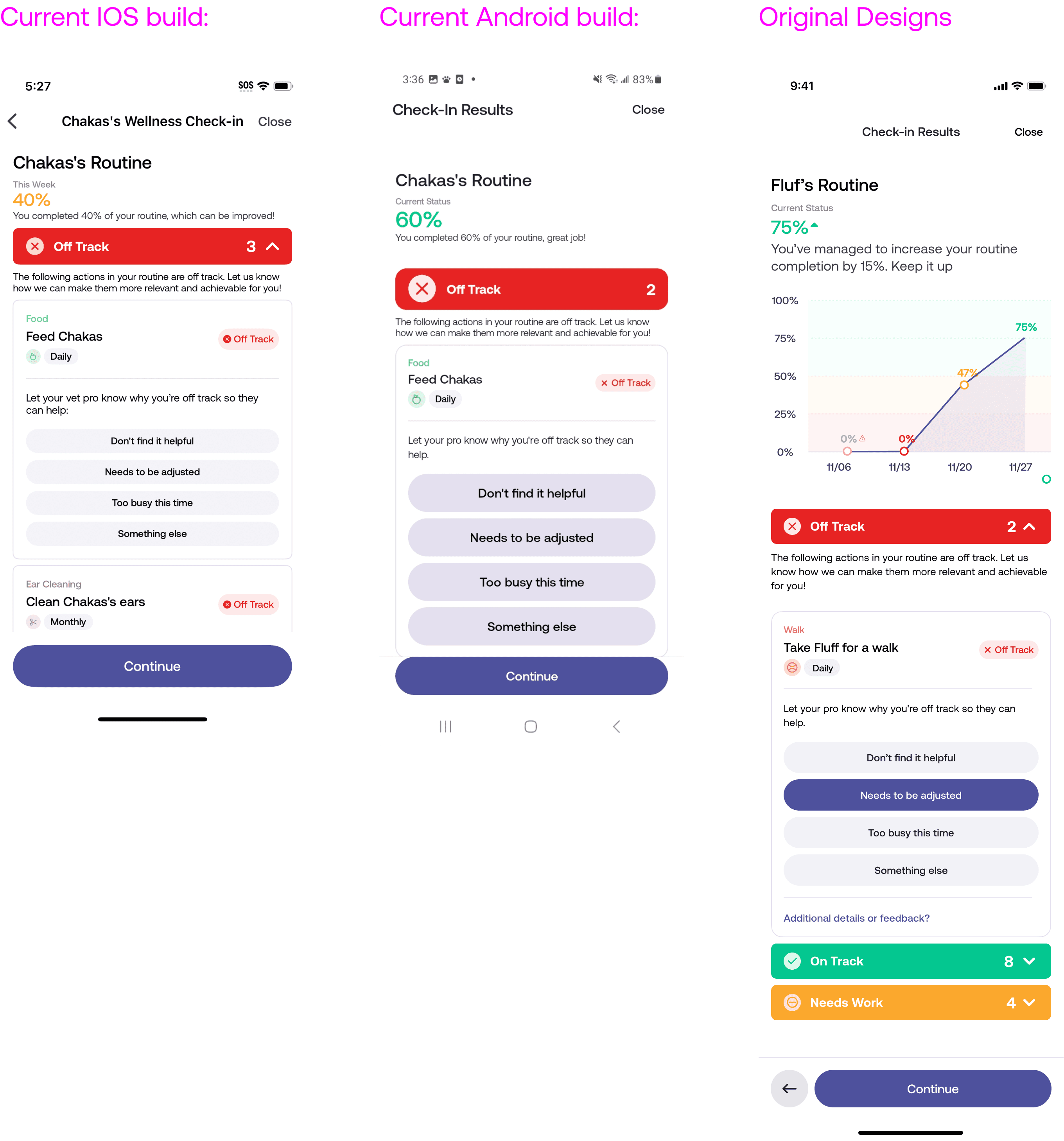
Design Audit: Screenshotting Android vs iOS vs Designs
Design Audit: Screenshotting Android vs iOS vs Designs
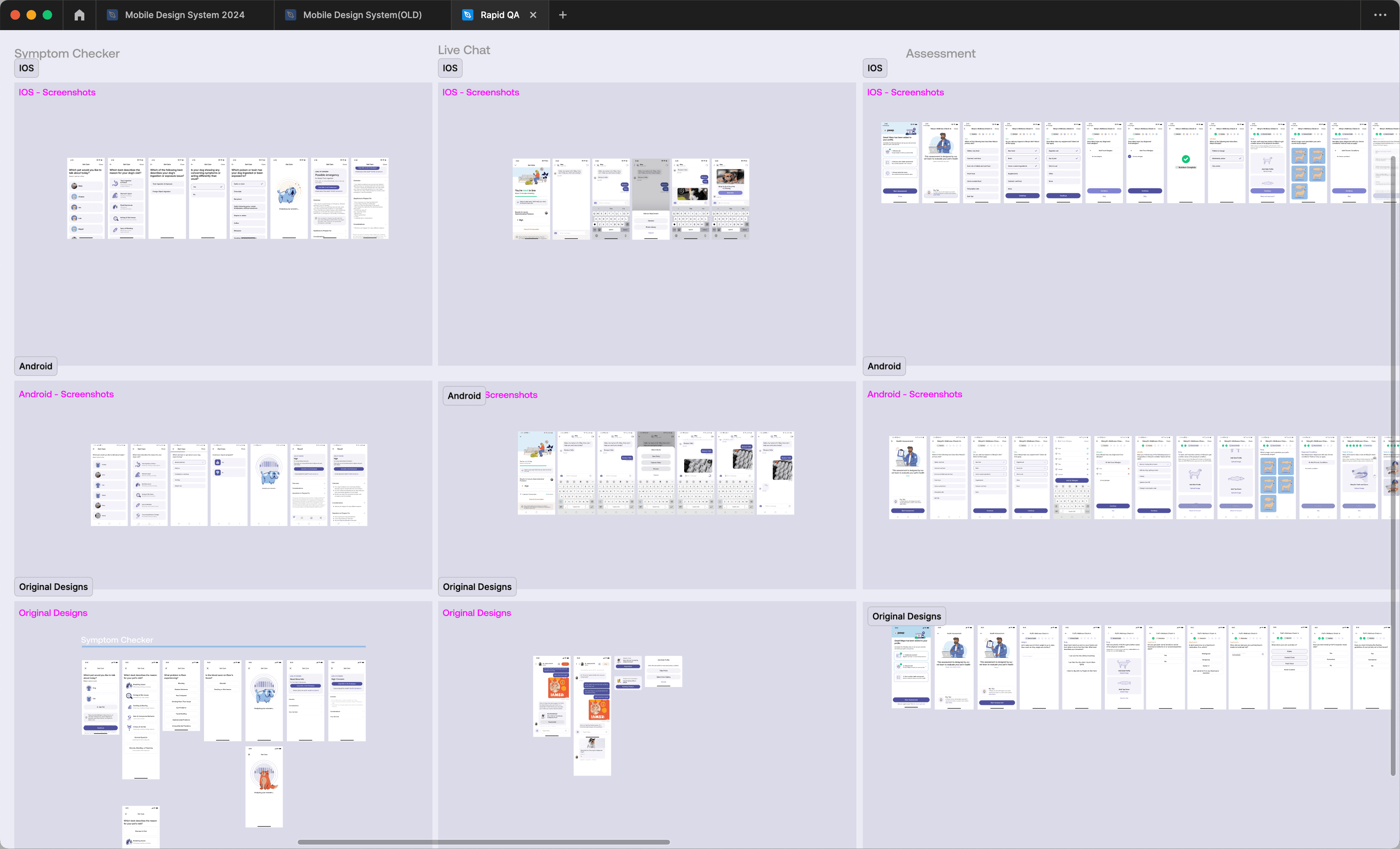

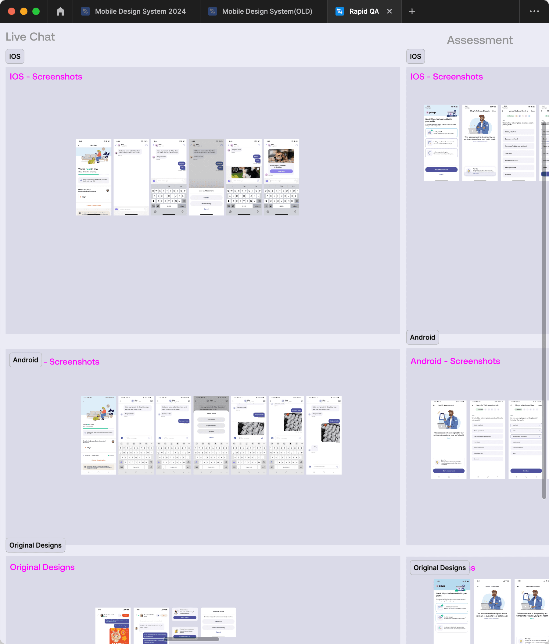

One of the things we ended up doing was taking an audit of how components and pages in Figma looked like versus what was live on iOS and Android.
We did this by just screenshotting the live app and comparing that with what we had in Figma.
Users can check-in weekly and the routine could be updated by the vet asyncly (without a live vet call) and can be updated weekly.
This would help our vets give a better sense of how a user is treating their pet and what lifestyle changes can be made to help mitigate certain (and common) issues.
We were hoping that this would also lead to more user engagement, as users would have to check-in every week in order to see if they’re routine is on track
Putting it all into a single source of truth
Putting it all into a single source of truth
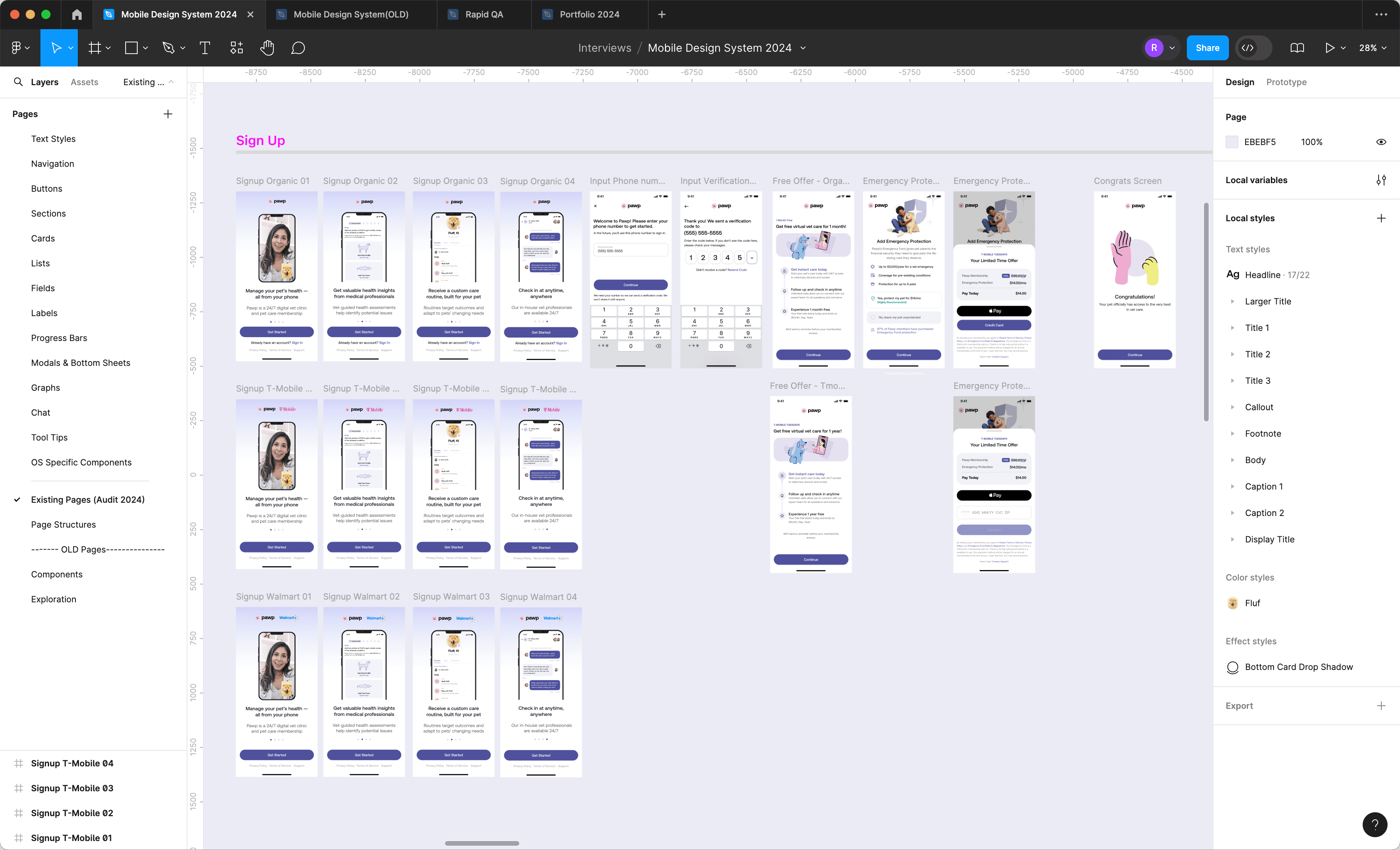
The pages and components we had in Figma were also scattered across a ton of separate files and seperate design system pages. During the audit, I took the time to help group them together and even map out a full flow of how our app looks like from sign up to a vet call.
The pages and components we had in Figma were also scattered across a ton of separate files and seperate design system pages. During the audit, I took the time to help group them together and even map out a full flow of how our app looks like from sign up to a vet call.


Reformatting and Organization
Reformatting and Organization
Once everything was in one file, we decided to re-organize how we had the components set up as well.
Once everything was in one file, we decided to re-organize how we had the components set up as well.
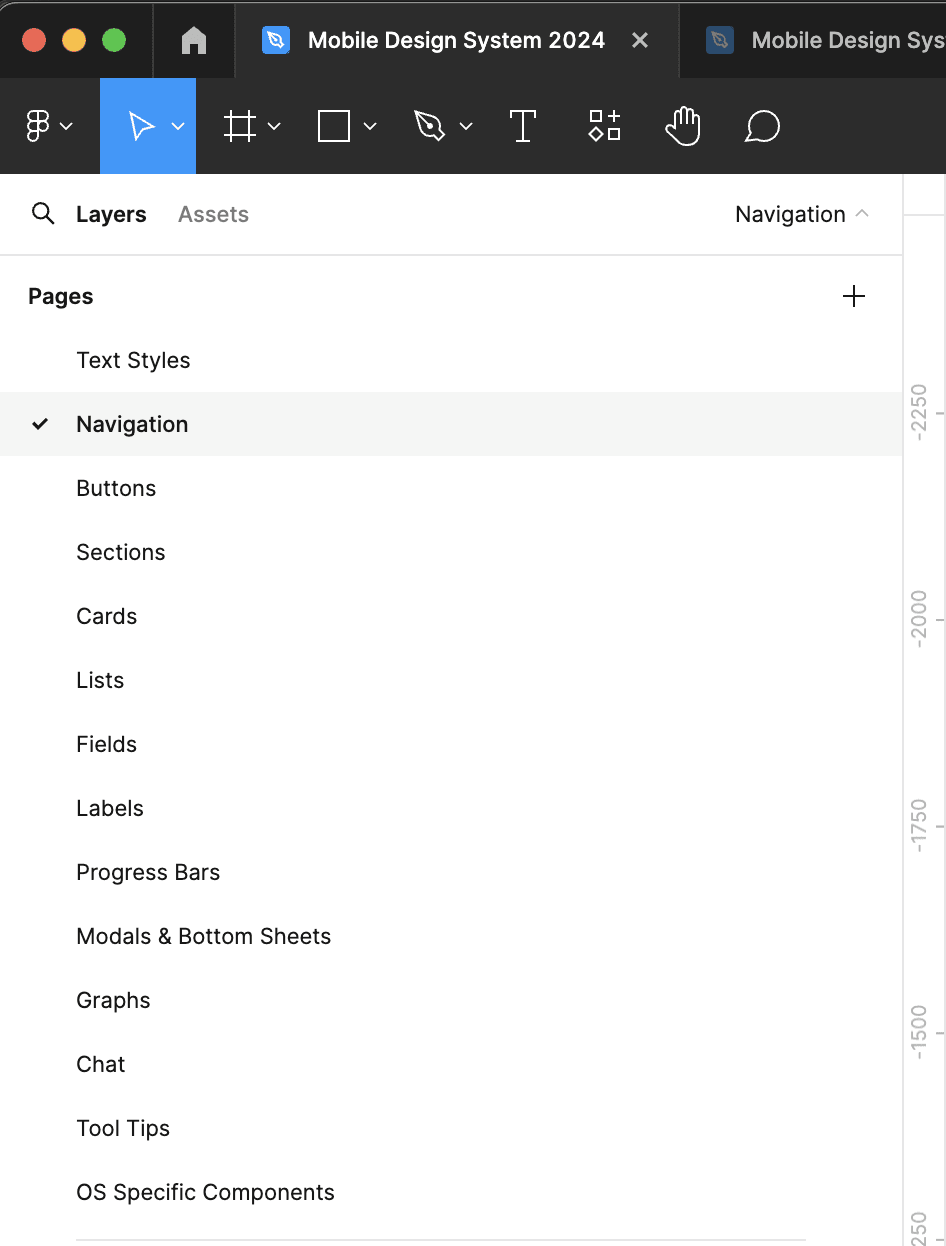

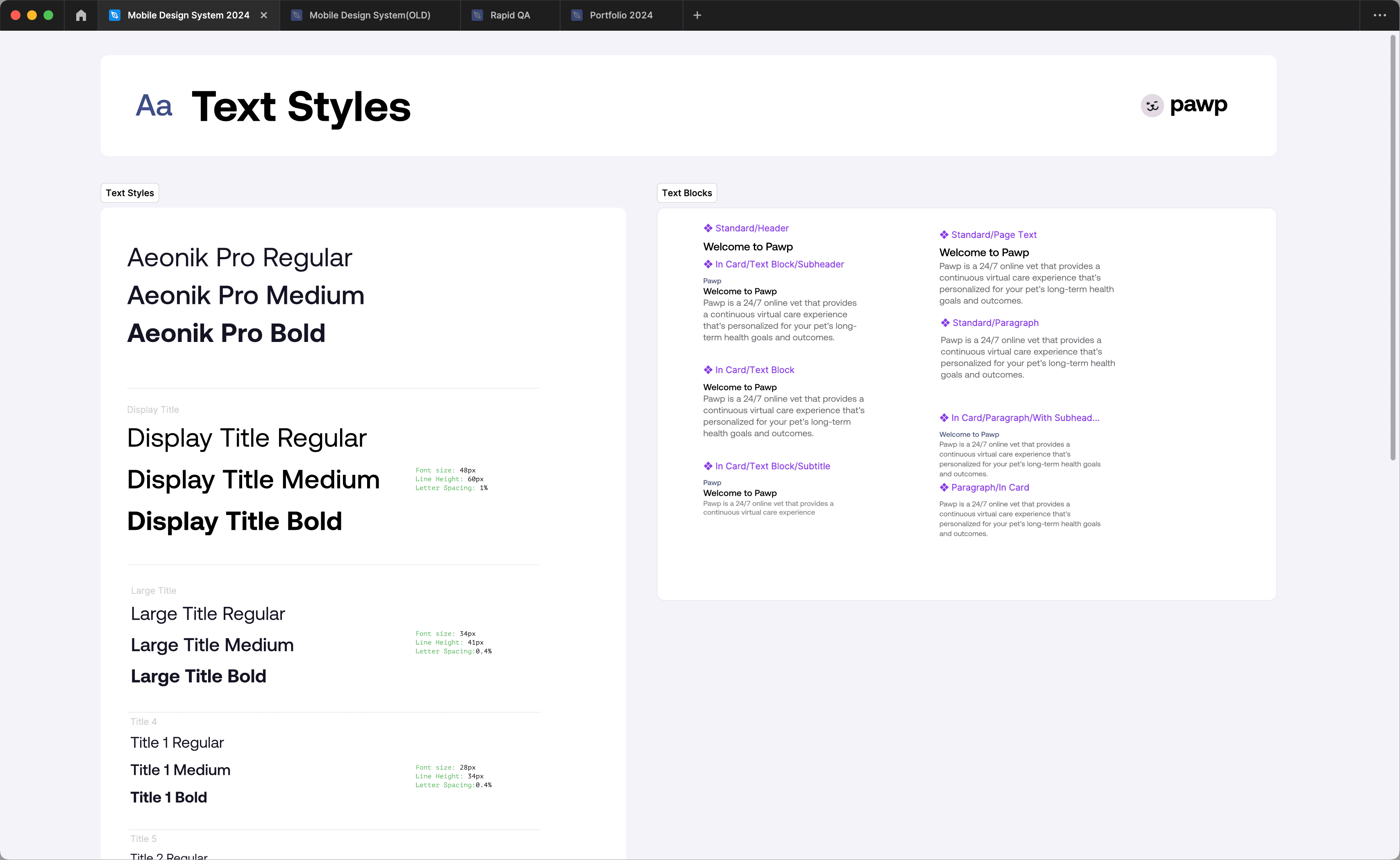


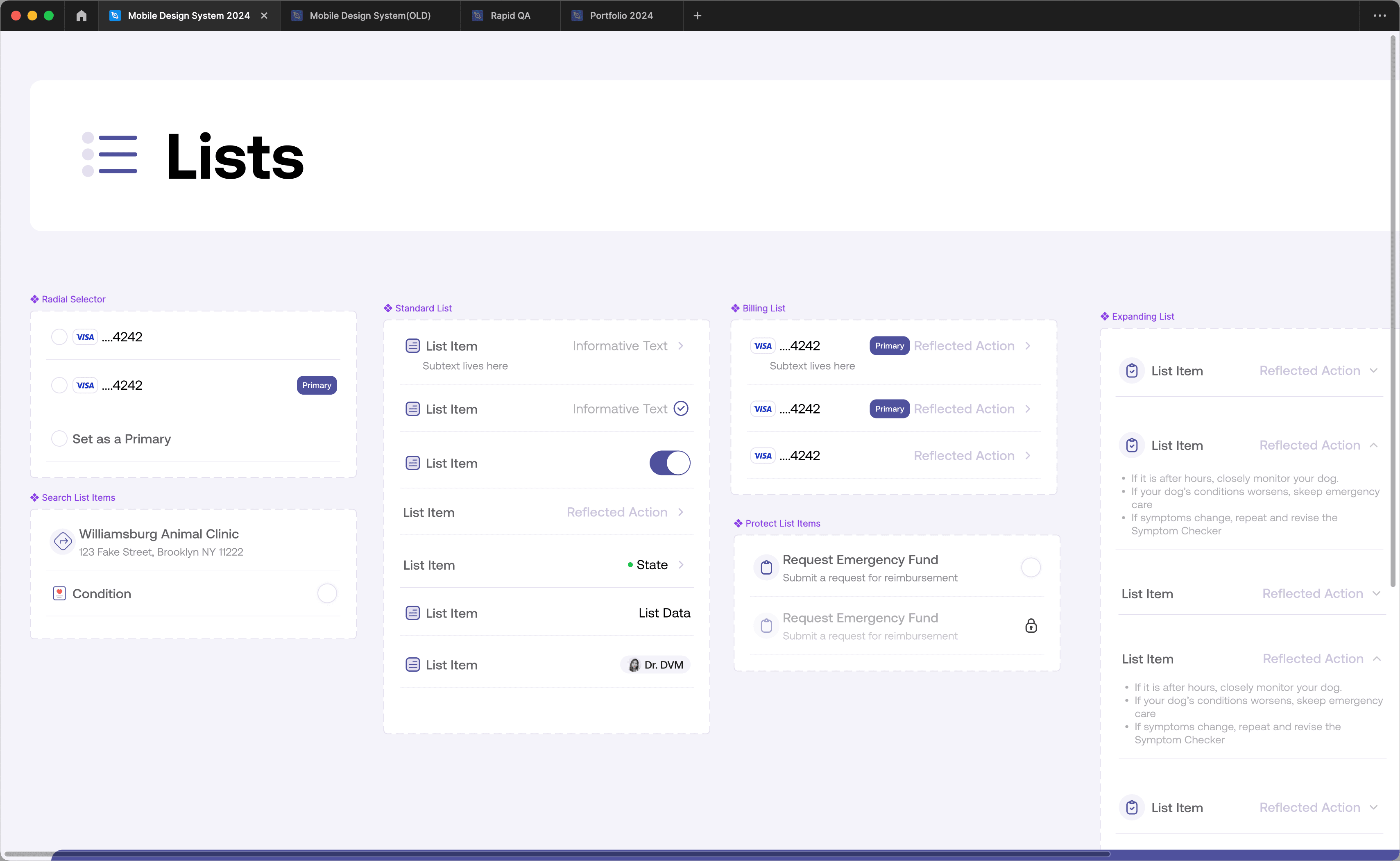


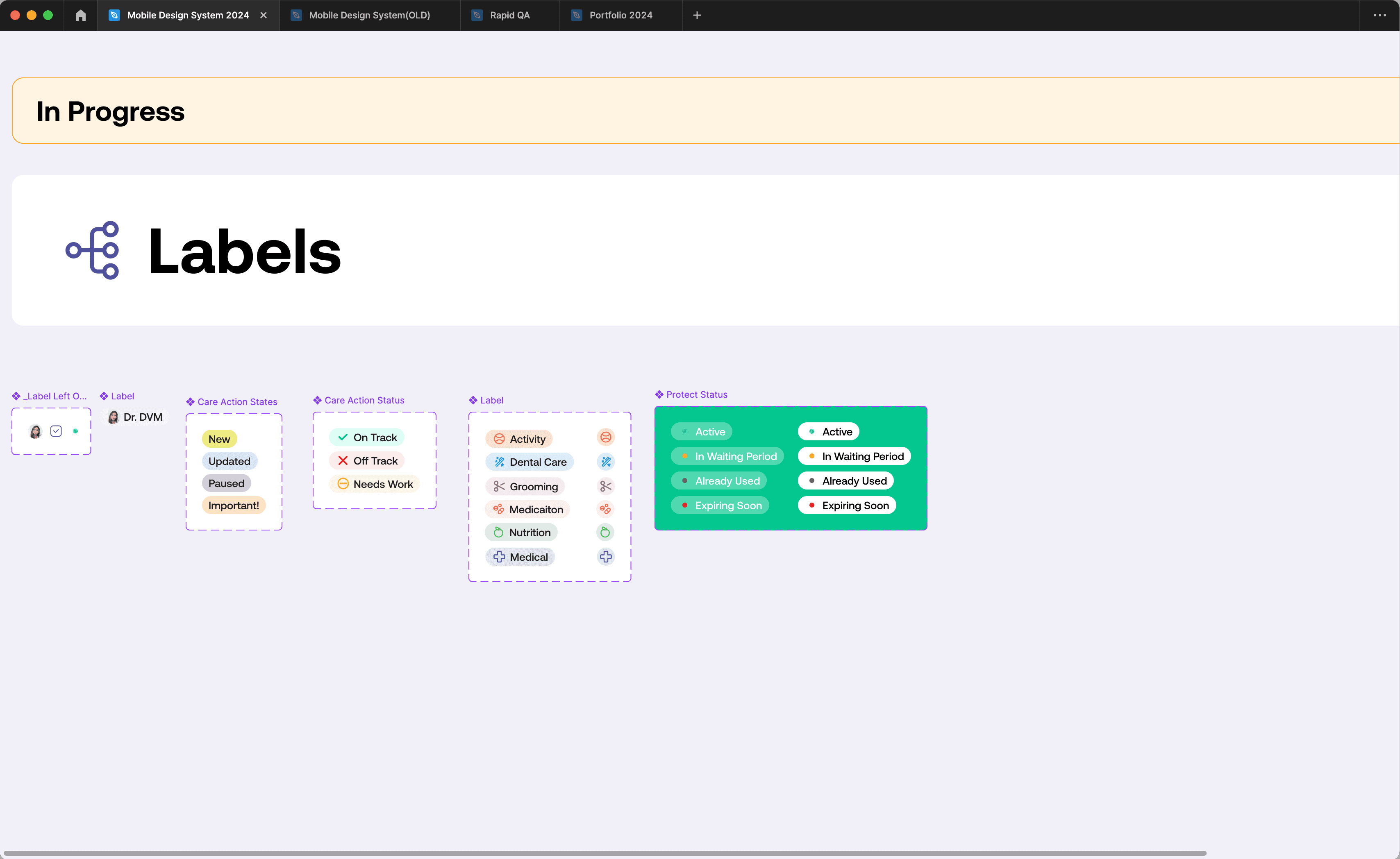


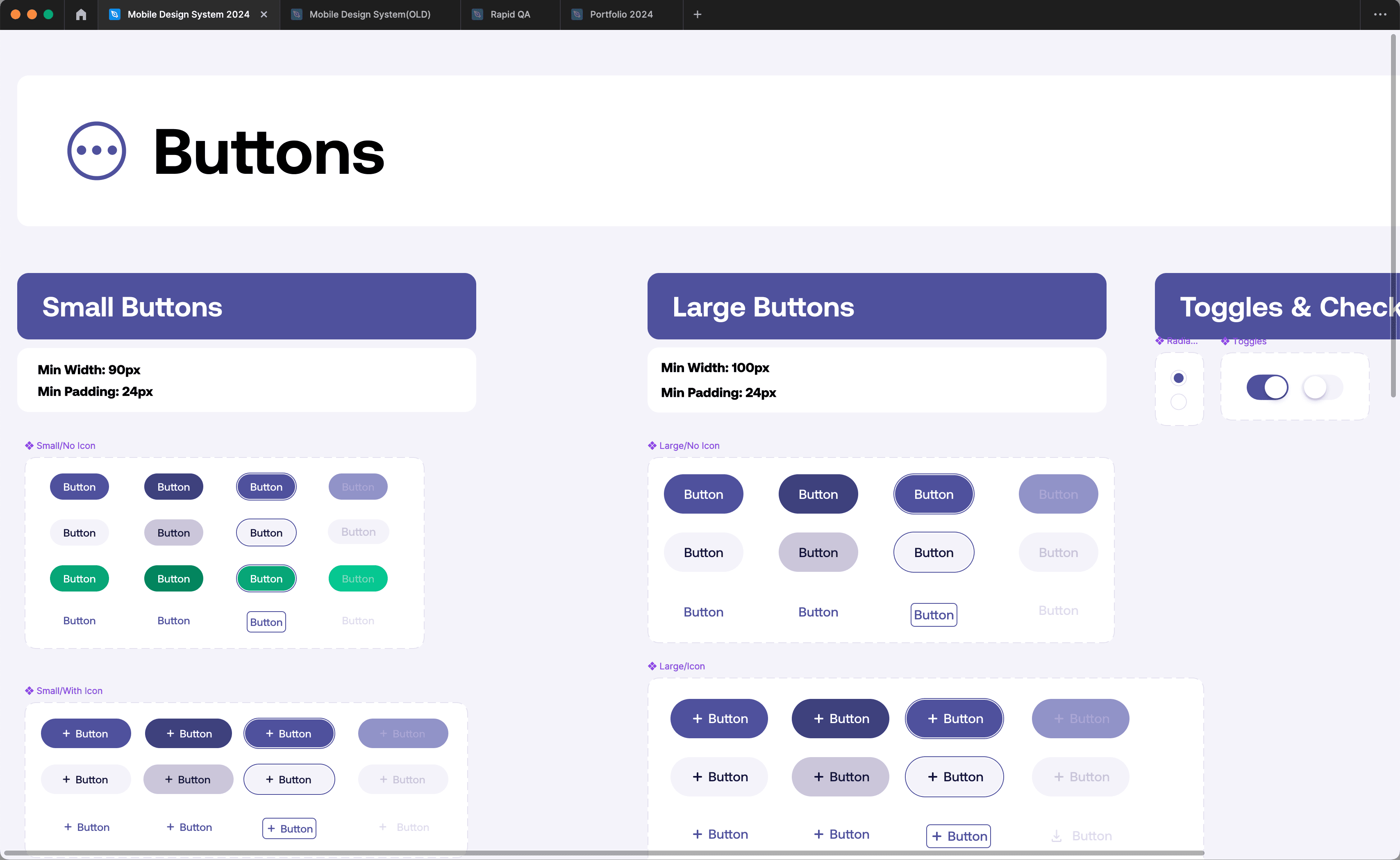


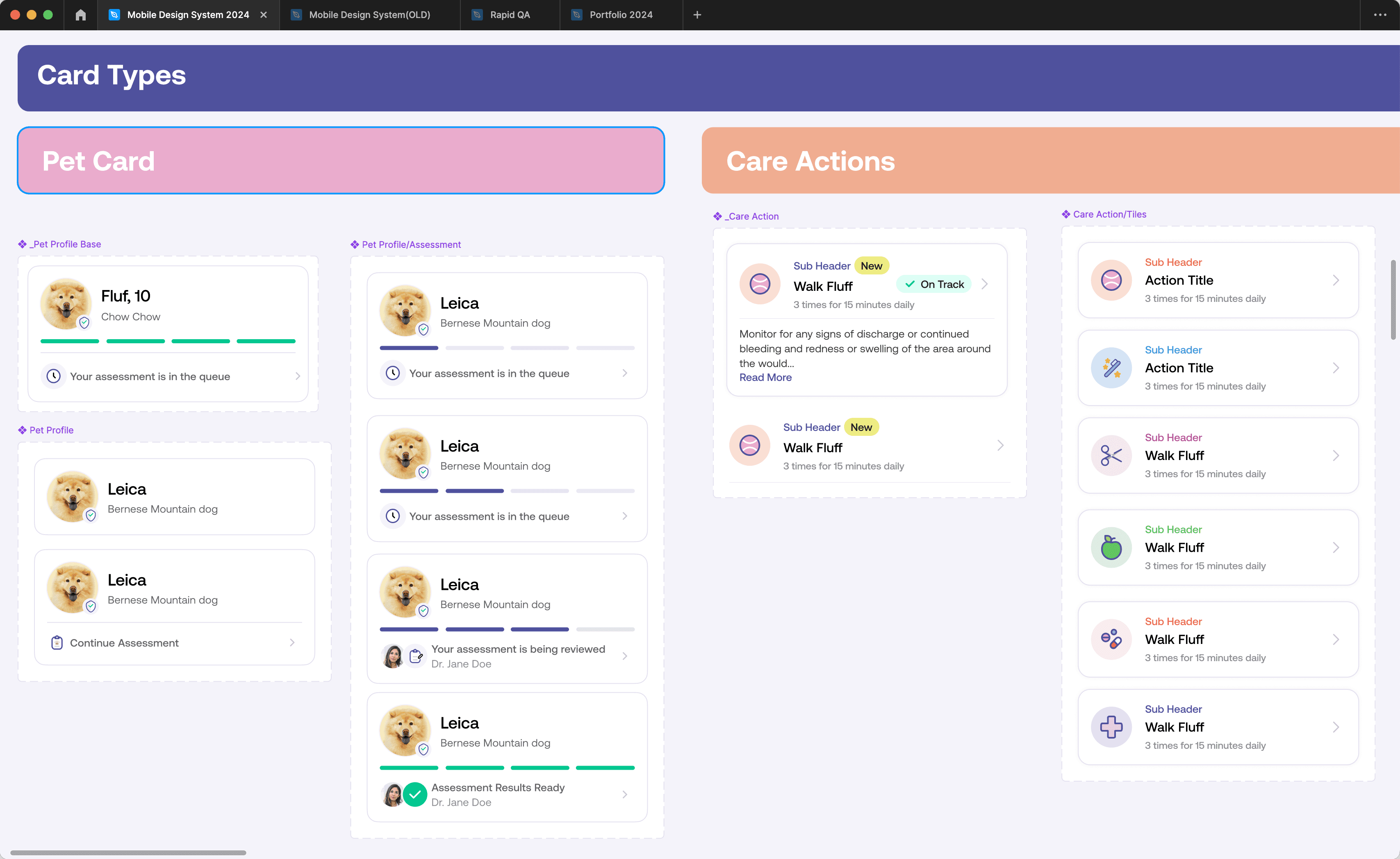


Once things were better organized I partnered with the devs to do design reviews on older features
Once things were better organized I partnered with the devs to do design reviews on older features
I would sit with the devs and do design reviews on past designs. We also started to do these design reviews more frequently whenever we would ship a feature.
I would sit with the devs and do design reviews on past designs. We also started to do these design reviews more frequently whenever we would ship a feature.


rileyco@live.com
