Some Context
One of the most popular content types on our system have been quizzes, though the original design was left outdated and un-able to fit specific business requirements. We re-visited quizzes with the hope to make them more dynamic, and appeal to more of our users.
One of the most popular content types on our system have been quizzes, though the original design was left outdated and un-able to fit specific business requirements. We re-visited quizzes with the hope to make them more dynamic, and appeal to more of our users.
TEAM
Designers: Me, Vanessa H
User Research: Katherine R
Designers: Me, Vanessa H
User Research: Katherine R
The Problem
The Problem
The original quiz designs were simple and a popular feature being used among our users, but weren’t designed to have a succession of quizzes all bundled up one after another. The current design of the quizzes also made it hard for us to just simply “stitch” together a number of quizzes
The original quiz designs were simple and a popular feature being used among our users, but weren’t designed to have a succession of quizzes all bundled up one after another. The current design of the quizzes also made it hard for us to just simply “stitch” together a number of quizzes
Added Value for Promoted
Content
Added Value for Promoted
Content
Our original quizzes are also a fairly popular content type to be used when monetized through sponsored content, so updating the design to add more features and make it more useful for our clients was a no-brainer.
Our original quizzes are also a fairly popular content type to be used when monetized through sponsored content, so updating the design to add more features and make it more useful for our clients was a no-brainer.
Added Value for CME Activities
Added Value for CME Activities
Another use case for quiz series would be for CME activities also sold within figure 1. CME stands for continuing medical education is mandatory in a number of states in the US in canada. Basically, to earn credits, physicians would have to complete tests or quizzes through lengthy typeform quiz we would send them via email and not integrated within our app. With the addition of quiz series, we wouldnt need to upload cme content to another platform.
Another use case for quiz series would be for CME activities also sold within figure 1. CME stands for continuing medical education is mandatory in a number of states in the US in canada. Basically, to earn credits, physicians would have to complete tests or quizzes through lengthy typeform quiz we would send them via email and not integrated within our app. With the addition of quiz series, we wouldnt need to upload cme content to another platform.
Starting Off with User Research
Starting Off with User Research
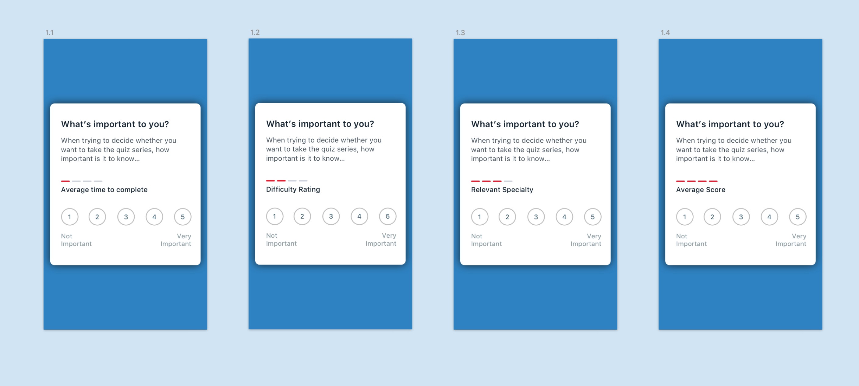


We sent an initial survey out to our users to gauge interest in how they would want quiz series to be formatted. From there we gauged what features in a quiz series users would find useful.
We had assumptions on how hard the quiz content should be as well as assumptions on whether or not we should gamify quizzes and put users quiz scores up against their peers.
Users can check-in weekly and the routine could be updated by the vet asyncly (without a live vet call) and can be updated weekly.
This would help our vets give a better sense of how a user is treating their pet and what lifestyle changes can be made to help mitigate certain (and common) issues.
We were hoping that this would also lead to more user engagement, as users would have to check-in every week in order to see if they’re routine is on track
Quiz Series Architecture
Quiz Series Architecture



Front Matter
The first screen involved in a quiz series was what we called the front matter, a requirement needed any CME activity taken on the internet.
This screen basically introduces users to what will be involved with the quiz, the learning objectives, who wrote the quiz as well as the ability to save, share and follow the quiz for later.
We also wanted to show data from other users taking the quiz.



Updating the actual quiz pages
In terms of the actual layout of the quizzes, we redesigned the UI to look a bit more minimal, as we found that the current design’s blue clashed a lot with some of the branded content that we have.
The original buttons we’re not designed to expand well for long answers.
We also added a progress bar and navigatigation to the bottom to shift between quizes.
In general, the aim for this design was to make it easier to fift through multiple quizes all after each other, which required us to somewhat squish some of the content together.
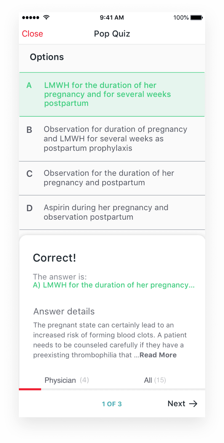


Card Elements containing answer details
When a user would select an answer, a card element would pop up from the bottom displaying the answer details as well as the comment section.
This way, users can discuss outcomes of a particular quiz and discuss the answers among themselves. For CME quizzes, this feature would be turned off.
When a user would select an answer, a card element would pop up from the bottom displaying the answer details as well as the comment section.
This way, users can discuss outcomes of a particular quiz and discuss the answers among themselves. For CME quizzes, this feature would be turned off.
The full flow of the quiz series would look like this
The full flow of the quiz series would look like this
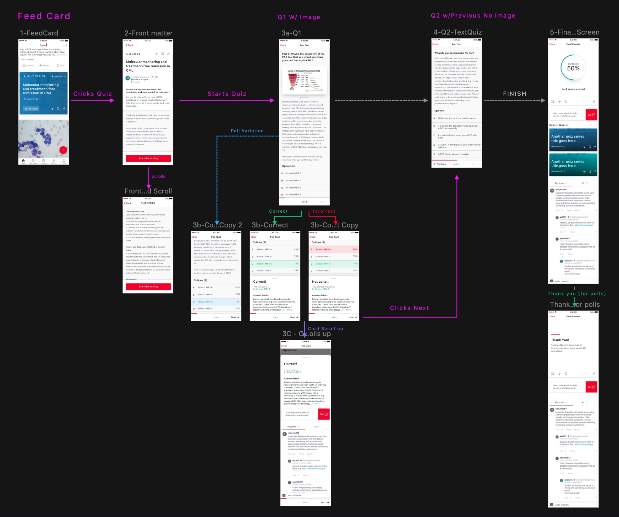


Compared to the old flow designs that simply had a quiz Yes or No Page.
Our new quiz series would let users:
Compared to the old flow designs that simply had a quiz Yes or No Page.
Our new quiz series would let users:
Enter the activity through the main feed.
Read up on the “front matter” that mentioned what the quiz was about
Enter the actual quiz designs. We also needed a "Poll variation as well"
See the correct answer along with answer details if the user was curious.
Finally, users could see a final screen to show results, as well as portals to other quizzes.
rileyco@live.com
